Power tree diagrams#
sysLoss can produce graphical power tree diagrams from a system, and this notebook will take you through the process including how to customize the look of the diagram.
Import packages:
from sysloss.components import *
from sysloss.system import System
import sysloss.diagram as sd
Graphviz needs to be installed before using sysLoss diagrams. When running sysLoss in an anaconda environment, Graphviz is installed simply with:conda install anaconda::graphviz.
Otherwise follow instructions on grapviz.org.
System definition#
Start by defining a system for analysis, in this case a relay and light control module powered from 48V.
rcm = System("Relay control module", Source("48V", vo=48, rs=0.01, limits={"io":[0, 2]}))
rcm.add_comp("48V", comp=RLoss("Fuse", rs=30e-3, limits={"io":[0, 2]}))
rcm.add_comp("Fuse", comp=Converter("12V buck", vo=12, eff=0.85, limits={"io":[0, 8]}))
rcm.add_comp("12V buck", comp=PSwitch("Load switch 1", rs=0.055, ig=10e-6))
rcm.add_comp("12V buck", comp=PSwitch("Load switch 2", rs=0.055, ig=10e-6))
rcm.add_comp("12V buck", comp=PSwitch("Load switch 3", rs=0.055, ig=10e-6))
rcm.add_comp("12V buck", comp=PSwitch("Load switch 4", rs=0.055, ig=10e-6))
rcm.add_comp("Load switch 1", comp=PLoad("LED array", pwr=3.7))
rcm.add_comp("Load switch 2", comp=RLoad("Relay 1", rs=180, loss=True), group="Relay board")
rcm.add_comp("Load switch 3", comp=RLoad("Relay 2", rs=180, loss=True), group="Relay board")
rcm.add_comp("Load switch 4", comp=RLoad("Relay 3", rs=180, loss=True), group="Relay board")
rcm.add_comp("12V buck", comp=Converter("3.3V buck", vo=3.3, eff=0.76, limits={"io":[0,2]}))
rcm.add_comp("3.3V buck", comp=LinReg("2.5V LDO", vo=2.5, limits={"io":[0,0.45]}))
rcm.add_comp("3.3V buck", comp=PLoad("MCU I/O", pwr=0.1), group="MCU")
rcm.add_comp("2.5V LDO", comp=PLoad("MCU I/O 2", pwr=0.15), group="MCU")
rcm.add_comp("2.5V LDO", comp=PLoad("Flash memory", pwr=0.066))
rcm.add_comp("3.3V buck", comp=Converter("1.2V buck", vo=1.2, eff=0.88, limits={"io":[0,0.5]}))
rcm.add_comp("1.2V buck", comp=ILoad("MCU core", ii=0.1), group="MCU")
The text-based tree() method:
rcm.tree()
Relay control module
└── 48V
    └── Fuse
        └── 12V buck
            ├── 3.3V buck
            │   ├── 1.2V buck
            │   │   └── MCU core
            │   ├── MCU I/O
            │   └── 2.5V LDO
            │       ├── Flash memory
            │       └── MCU I/O 2
            ├── Load switch 4
            │   └── Relay 3
            ├── Load switch 3
            │   └── Relay 2
            ├── Load switch 2
            │   └── Relay 1
            └── Load switch 1
                └── LED array
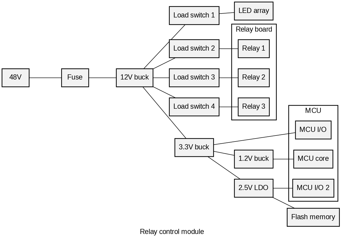
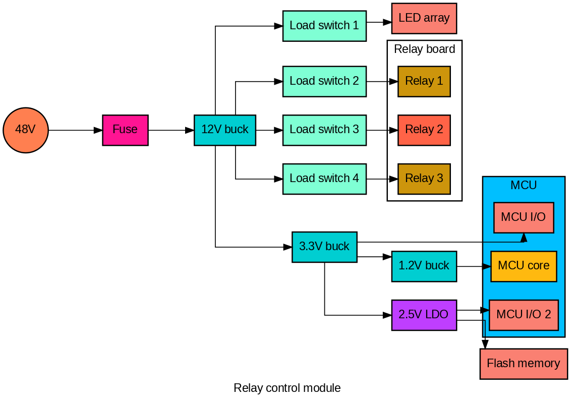
Graphics diagram#
sysloss is using Graphviz to render power tree diagrams. A graphics power tree diagram in top-bottom format is created with the function make_diag(), which returns a PIL.Image object.
Note
It is not possible to position lines between components, this is automatic by Graphviz. There are some attributes that influence how lines are drawn, see Graphviz documentation.
sd.make_diag(rcm)

The diagram can also be written directly to file by using the fname argument, the file extension defines the file format.
Tip
Use .png or .svg for best quality, .jpg is not recommended.
sd.make_diag(rcm, fname="control_module.svg")
Customize the diagram#
The power tree diagram can be customized using different Graphviz attributes. Familiarity with Graphviz is required to fully utilize the many attributes available.
The attributes used by sysLoss are:
Overall diagram: Graph attributes
Groups: Cluster attributes
Components: Node attributes
Lines: Edge attributes
The default Graphviz attributes used by sysLoss are defined in a Python dictionary, obtained by a call to the function get_conf():
my_conf = sd.get_conf()
my_conf
{'graph': {'rankdir': 'TB',
  'ranksep': '0.3 equally',
  'splines': 'line',
  'nodesep': '0.3',
  'overlap': 'scale',
  'dpi': '120',
  'fontname': 'arial',
  'fontcolor': 'black'},
 'cluster': {'default': {'rank': 'same',
   'fillcolor': 'white',
   'style': 'filled',
   'penwidth': '1.5',
   'fontname': 'arial',
   'fontcolor': 'black'}},
 'node': {'default': {'fillcolor': 'gray95',
   'style': 'filled',
   'shape': 'box',
   'penwidth': '1.5',
   'fontname': 'arial',
   'fontcolor': 'black'}},
 'edge': {'arrowhead': 'none',
  'headport': 'center',
  'tailport': 'center',
  'color': 'black'}}
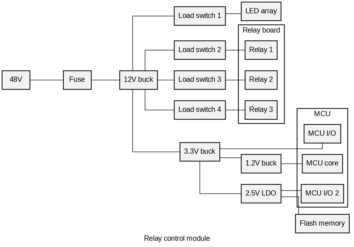
Let’s start by changing the layout from top-bottom to left-right:
my_conf["graph"]["rankdir"] = 'LR'
sd.make_diag(rcm, config=my_conf)
The lines can be changed to orthogonal type:
my_conf["graph"]['splines']="ortho"
sd.make_diag(rcm, config=my_conf)
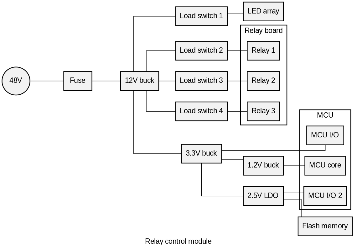
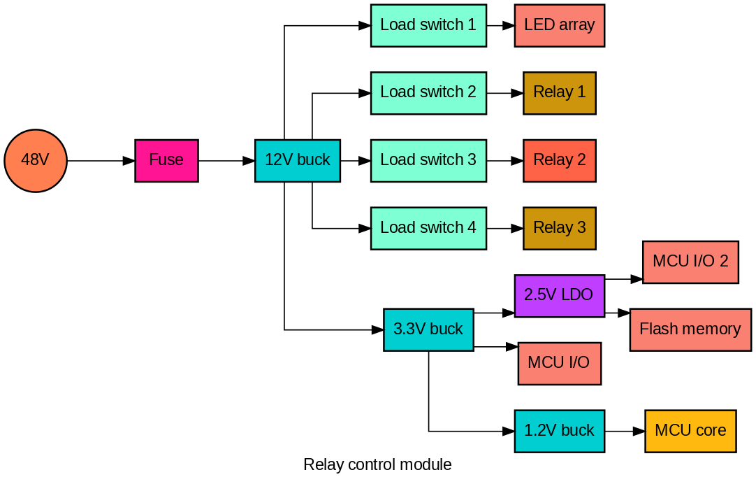
Component shape, color etc. can be customized by component type. Let’s change the source shape to be round:
my_conf["node"]["Source"] = {"shape":"circle"}
sd.make_diag(rcm, config=my_conf)
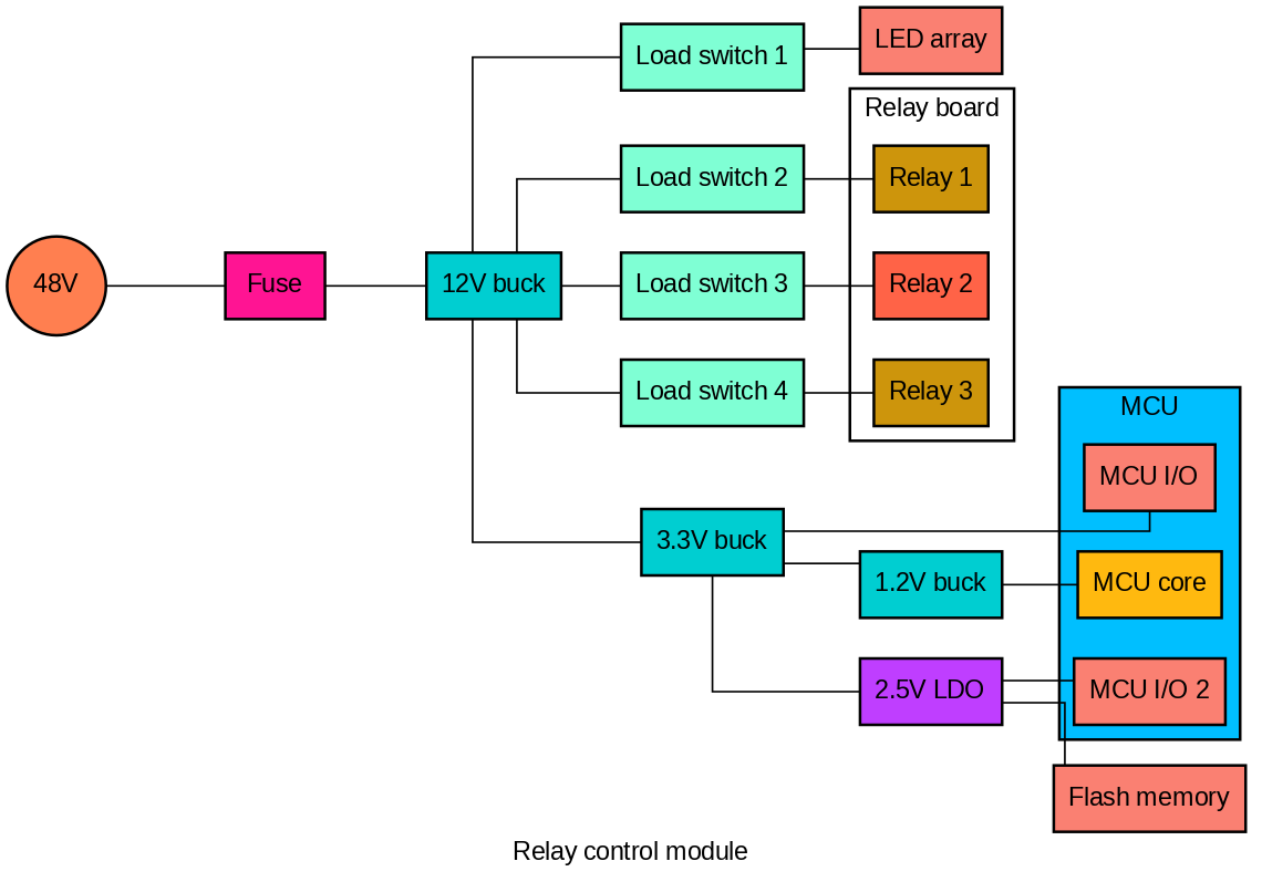
We can also add individual colors to each component type, groups or even individual components:
my_conf["node"]["Source"] = {"shape":"circle", "fillcolor":"coral"}
my_conf["node"]["Converter"] = {"fillcolor":"darkturquoise"}
my_conf["node"]["ILoad"] = {"fillcolor":"darkgoldenrod1"}
my_conf["node"]["PLoad"] = {"fillcolor":"salmon"}
my_conf["node"]["RLoad"] = {"fillcolor":"darkgoldenrod3"}
my_conf["node"]["RLoss"] = {"fillcolor":"deeppink"}
my_conf["node"]["LinReg"] = {"fillcolor":"darkorchid1"}
my_conf["node"]["PSwitch"] = {"fillcolor":"aquamarine"}
my_conf["node"]["Relay 2"] = {"fillcolor":"tomato1"}
my_conf["cluster"]["MCU"]= {"fillcolor" :"deepskyblue"}
sd.make_diag(rcm, config=my_conf)
Lines can also be modified, let’s add an arrowhead:
my_conf["edge"]["arrowhead"] = "normal"
sd.make_diag(rcm, config=my_conf)
Tip
Grouping can be disabled by setting the group parameter to False.
sd.make_diag(rcm, group=False, config=my_conf)
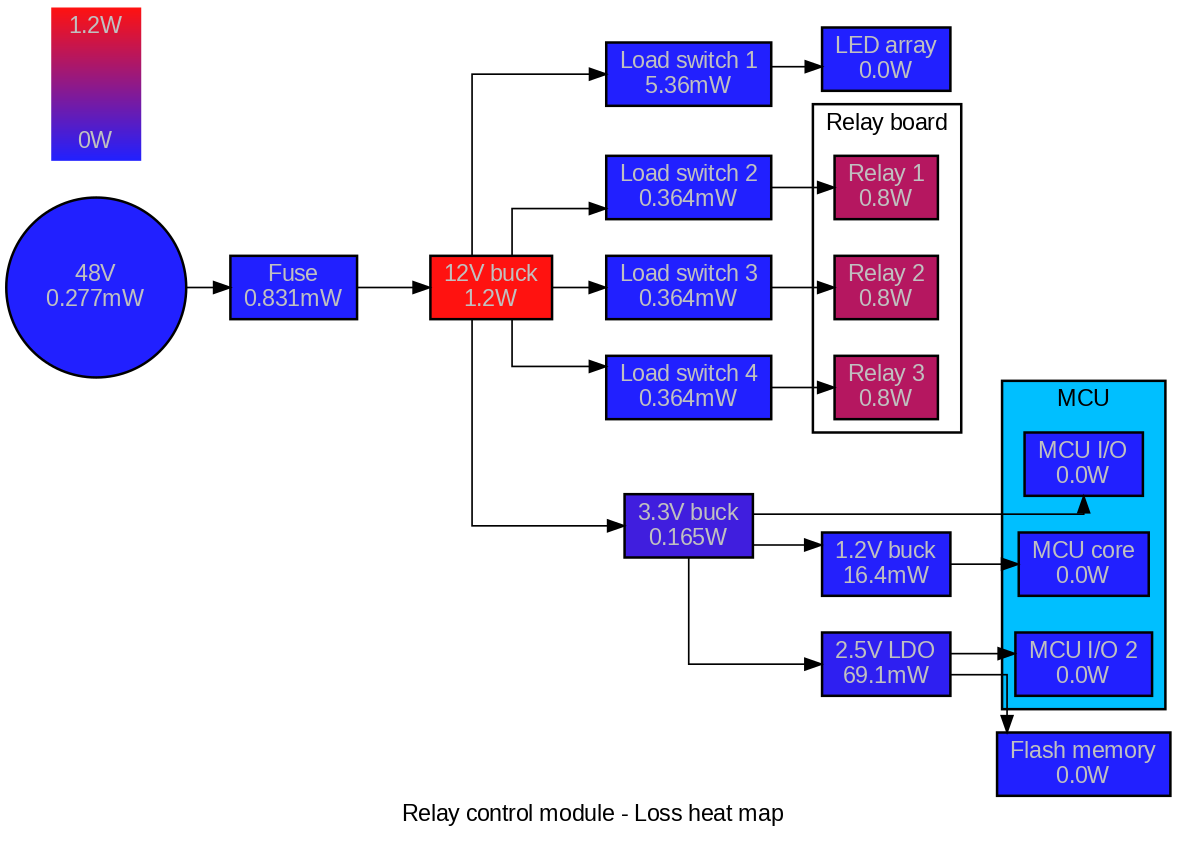
Heat diagram#
sysloss can also generate heat diagrams, showing the power tree with gradient-colored components. Components are also annotated with the loss in Watts. The system is solved before the diagram is made.
Note
If system load phases have been defined, the weighted average loss is used in the heat diagram. Component colors are overridden with gradient colors, other configurations are kept.
sd.make_hdiag(rcm, config=my_conf)
Summary#
Power tree diagrams are created using functions from the diagram package. The diagrams can be customized with Graphviz attributes.